What do we love about fall? Television and movies of course!! The best TV series of the year are about to start and we can’t help but get excited about the amazing set designs. Sometimes we find ourselves watching shows just to look at the beautiful sets! Let’s break them down to figure out what makes these rooms tick. You may not even realize that’s what makes you love the show! A good set that is practical and also glamorous makes the characters and the show even more appealing.
Jay and Gloria’s house in Modern Family is a clean lined contemporary design, but the real impact is the fabulous abstract art. We love the gray, yellow and rust color schemes throughout the house as well as the sleek furniture.

 The casual and comfortable design of the Dunphy’s house is full of life and capable of withstanding the wear and tear of a large family. The blue, red and khaki color pallet creates a stylish and fun environment that is inviting to both kids and adults. Our favorite thing about this design is the collection of family photographs along the stairway. This is a stylish way to display your personal memories and photos.

We also love how the kitchen opens up to the breakfast room and the family room. Notice the fun, fresh pillows and eclectic art collections!

So maybe it’s not the funniest show on TV this fall, but Courtney Cox’s house in Cougar Town is a beachy, chic and fresh design that we are absolutely in love with. Even though the show is kind of lame, we continue to watch it just to see the set!

We love the fabric on this chair! Mixing patterns in upholstery is a great way to add interest and give your space a layered look.

The best movie set by far is Meryl Streep’s house in It’s Complicated. The cottage industrial look is so popular right now and it is by far our favorite style for this fall!
 We love how this living room seems so perfectly casual and thrown together.
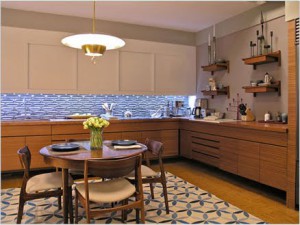
 Carrie and Big’s apartment in sex and the City is stunning. The set designer achieved a modern, luxurious and sophisticated space by mixing textures and colors. The blue back-splash, wood and metal collectively create an extremely impressive visual impact.

 Our obsession with the beach house from Something’s Gotta Give instantly began when we saw this movie. This Hampton-chic design helps set a romantic scene for the movie. We live the mix of antique and modern elements as well as the cozy beachy feel.


 Even though we hated Ben Affleck in the moment he wouldn’t commit to Jennifer Aniston, we still love a man who hangs art. Their apartment in He’s Just Not That Into You is gorgeous! The exposed brick walls and perfect accessories make this set look bohemian and eclectic. We don’t know what looks better in this shot, the art or Ben’s butt!


