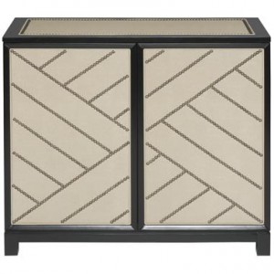
Thom Filicia’s new line in the Vanguard showroom was the most inspiring and exciting collection we saw at the 2010 High Point Market. The collection’s modern take on classical pieces of furniture is remarkable. Filicia has a way of mixing elements of classic furniture with modern colors and lines, which helped achieve a look that evokes not only a sense of sophistication, but also provides functionality. This chest can be customized in any fabric, but we always prefer this sleek white leather. The contrast of the leather and nail head trim is beautiful.
 This chest can be customized in any fabric, but we always prefer this sleek white leather. The contrast of the leather and nail head trim is beautiful.
 This dining table has an interesting profile. The sharpness of the table legs balances the roundness of the table top. The circle joining the legs adds just the right element of symmetry in the center.
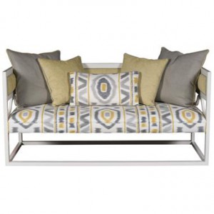
 This settee would look perfect in an entry way. The gray and yellow of the fabric are extremely popular this season and one of our favorite color schemes!


